Infographics are serious communication
Data visualization is effective
Even complex data can be easily understood when presented visually. Infographics can help you explain a process, show relationships, track events or make comparisons. They also have a lot of power to persuade because the data is right there in plain sight.
Why infographics draw your eye
Graphs, charts, maps and icons relay important information in a more digestible form than loads and loads of copy. They create a framework for understanding instead of simply transmitting unorganized, raw information.
• Visual information is understood more easily than text
• People tend to forget what they’ve read but remember what they’ve seen
• Design can simplify complex information
• Design draws attention and is more engaging than text
The creative checklist
Keep these guidelines in mind when developing your infographic.
Will this help my audience?
Infographics should be educational, relevant and useful to the reader.
Is it on brand?
The infographic needs to support your brand—colors, icons, brand elements and brand voice. If it doesn’t connect to your brand, you may just miss your mark.
Is it simple and focused?
Avoid putting too much information out there. It’s possible to represent millions of data points but limit it to what someone can comprehend in a few seconds. Simplify your message.
Does the information flow?
The information you’re presenting has to be concise and in a logical sequence. You don’t want to end up with a killer infographic from a visual standpoint but one that makes zero sense.
Is it credible?
Check and double check your facts. Infographics aren’t about opinions. Be sure to use credible sources and don’t forget to cite them.
Do the graphics and copy reinforce each other?
Visual elements keep it accessible, and text or numbers allow you to convey your message in enough detail to make your point.
Here are some examples.
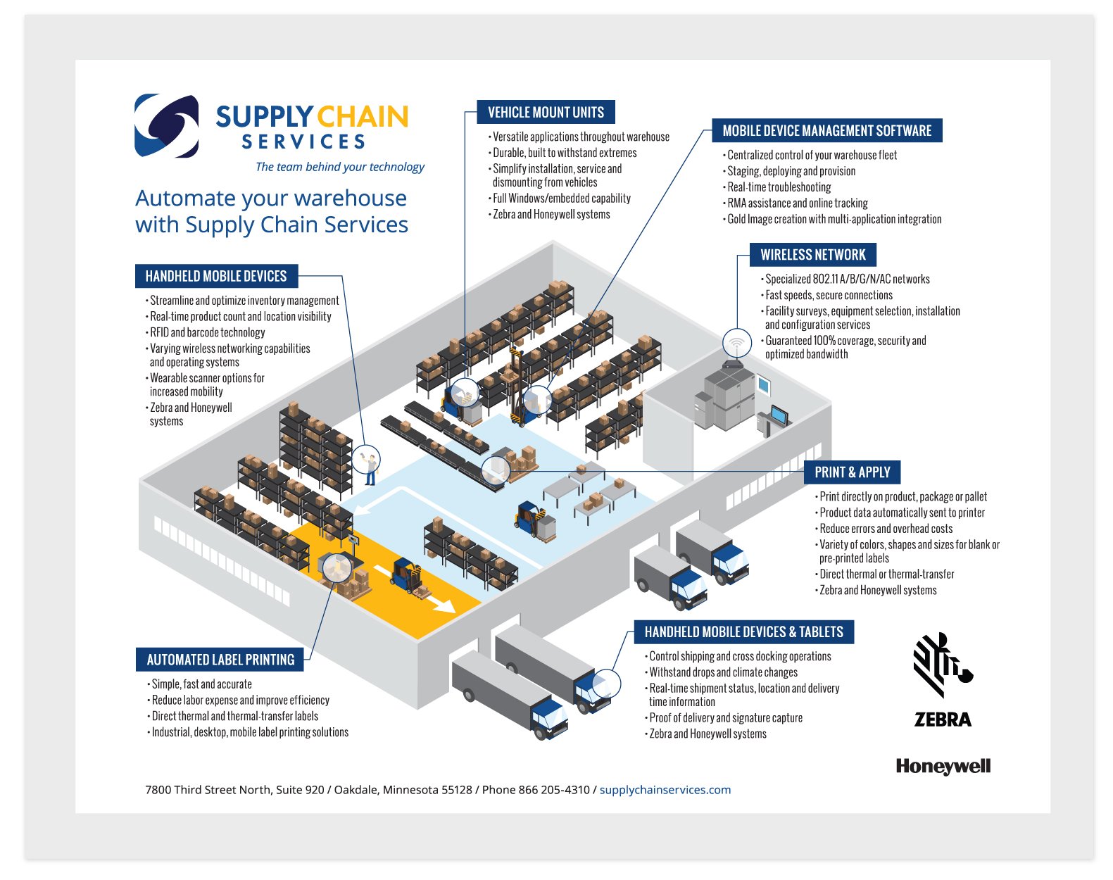
Product line infographic: Providing an easy-to-follow overview on automating a warehouse for increased productivity
Client: Supply Chain Services
Audience: Customers and prospects
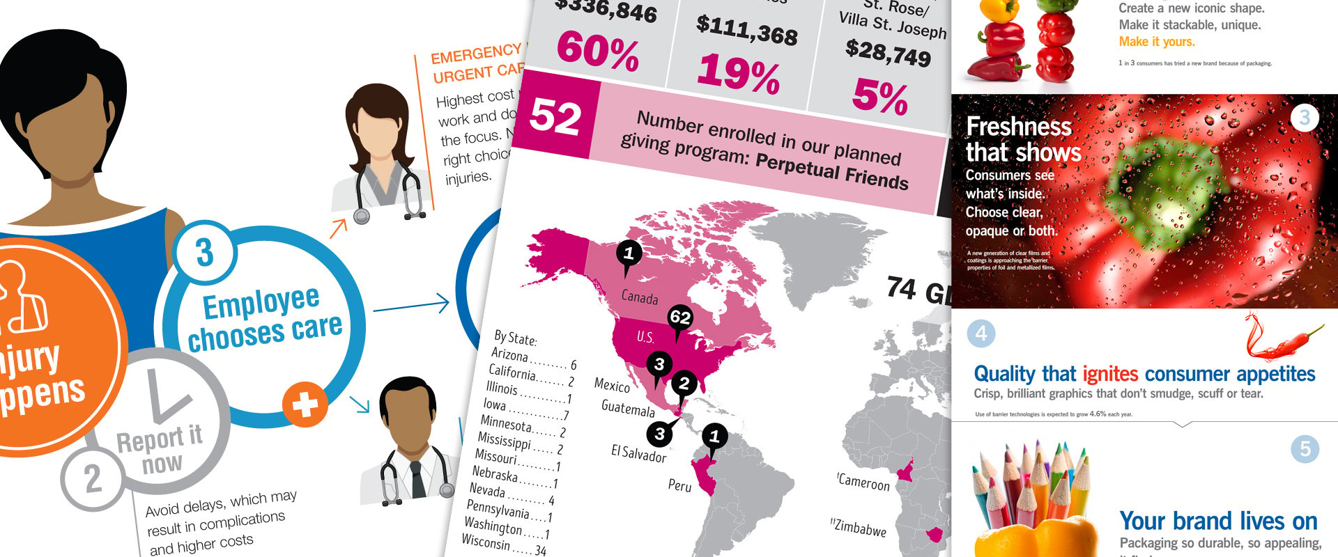
Comparison infographic: Illustrating how to navigate workers’ comp cases
Industry: Healthcare
Audience: B2B, employers
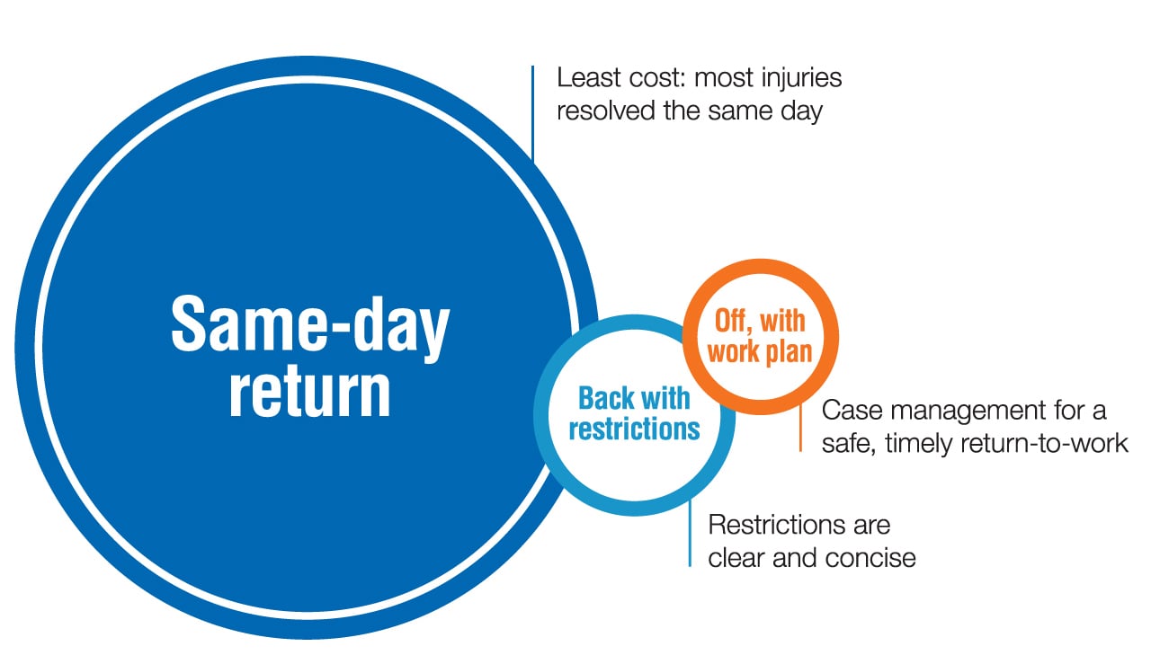
Some infographics as simple as the one below can be very effective at getting your message across.
Process infographic: Workers’ comp employee return-to-work plan
Industry: Healthcare
Audience: B2B, employers
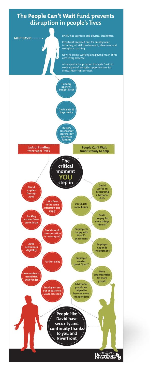
Decision tree infographic: Developed to illustrate the outcomes of a decision
Client: Riverfront (now Aptiv)
Audience: Donors
Benefit infographic: Developed to illustrate why it makes sense to use IML packaging
Client: Inland Packaging
Audience: B2B
Prepared to share?
It’s a visual world. Your infographic gives your audience something interesting to repost. To increase the chance of having your infographic shared and reposted on other blogs, think about SEO beforehand. Boost your search rankings by making sure the page loads quickly, using alt text for your visuals, optimizing the page for your keywords and using a descriptive URL.
1. Hubspot https://blog.hubspot.com/marketing/visual-content-marketing-strategy
