Refreshing your logo while retaining brand equity
Sometimes, a logo is outdated… plain and simple. But sometimes, a full redesign is not the best approach.
You might realize your logo needs a makeover, but don’t want to lose the social traction it has gained over the years. Leveraging that equity is important, so identify and consider keeping those recognizable elements that instantly connect with your audience. Tweaking the look and feel without losing those elements might give you the best of both worlds. You don’t always have to start from scratch with a completely new logo.
A fresh visual identity can be achieved with these changes:
- Adjust (modernize) any brand elements that appear dated. If you want to retain a historical character, it should be classic and timeless, but no one feels nostalgic about 1990s graphics.
- A slight shift in colors, expanded color palette or added accent color can create a brand new feel. Coca-Cola is synonymous with red, but new accent colors are regularly used to grab attention and create a mood.
- Update your font library with a more contemporary look. Readability is key. Your audience shouldn’t have to struggle to see you. The font should have visibility at a small size and visual presence on a billboard. Test it on the applications you expect to use to make sure it has the substance you want.
- Simplify. Un-design if needed by removing elements that don’t add to the logo. Avoid a busy feel unless it is part of what you want to project. A night club has a different vibe from a dental office.
- A tagline can communicate a new direction, differentiate you from your competition or communicate the value you offer. Find the right statement that conveys who you are and what you do.
Supply Chain Services asked us to “modernize” their logo.
This growing tech and services company had a logo with a heavy, industrial feel. They wanted to highlight their relationship and value to the customer rather than hardware, software or supplies alone.
The shift in emphasis from product to service began with adding a tagline, “The team behind your technology.” It positions the team as an extension of the customer, affirms Supply Chain Services technology design and support services and suggests “we’ve got your back.”
The condensed font was strong but rigid. It now reads much more easily and feels more refined.
We kept the movement in the logo but introduced a more organic and purposeful feel. The curved elements are now reversed from the shape, making it more integrated with the square than it formerly was with multiple overlapping shapes. An interesting negative space visually pops. Lastly, the dark blue accent color gives it extra dimension without introducing a harsh black.
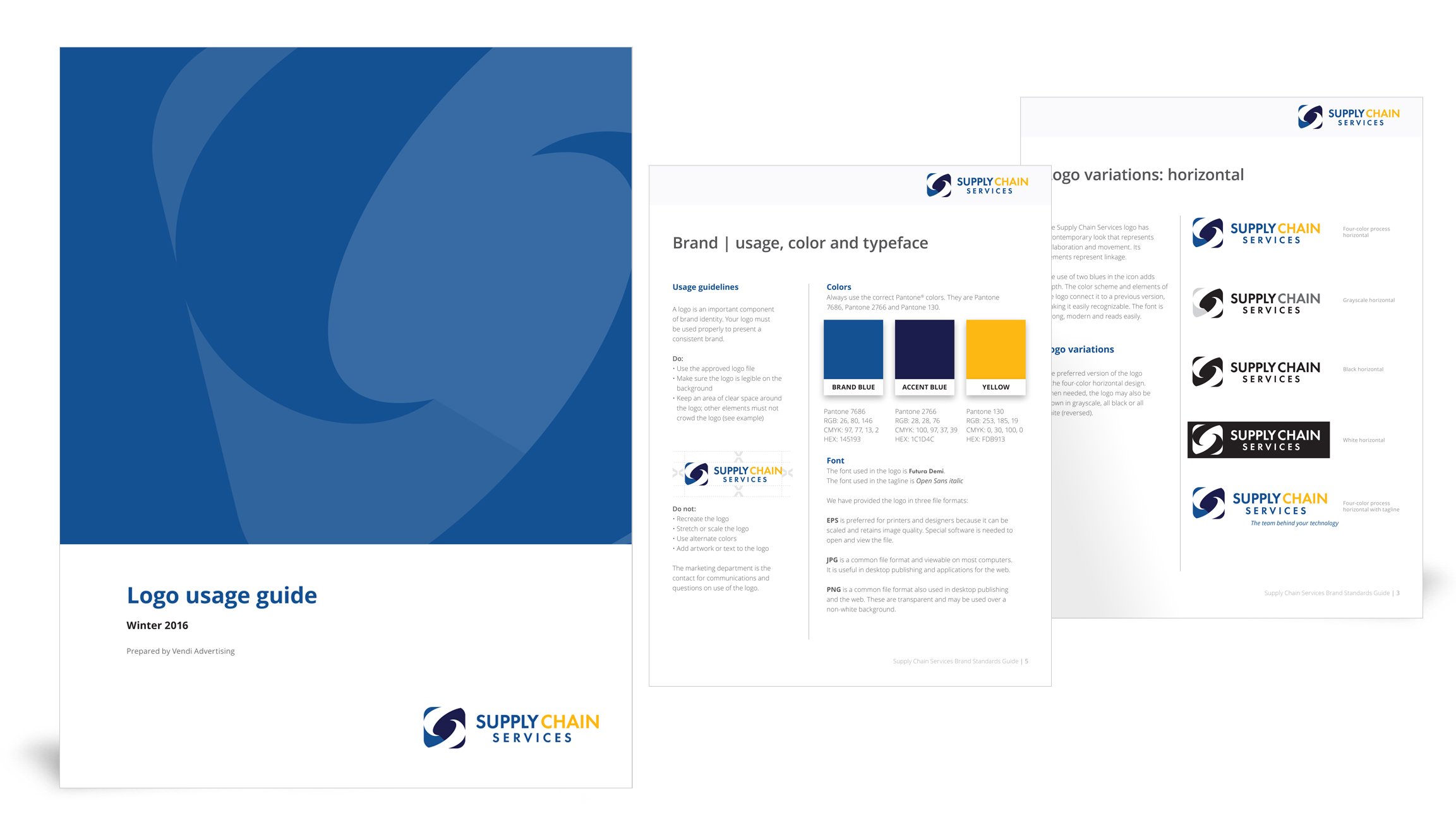
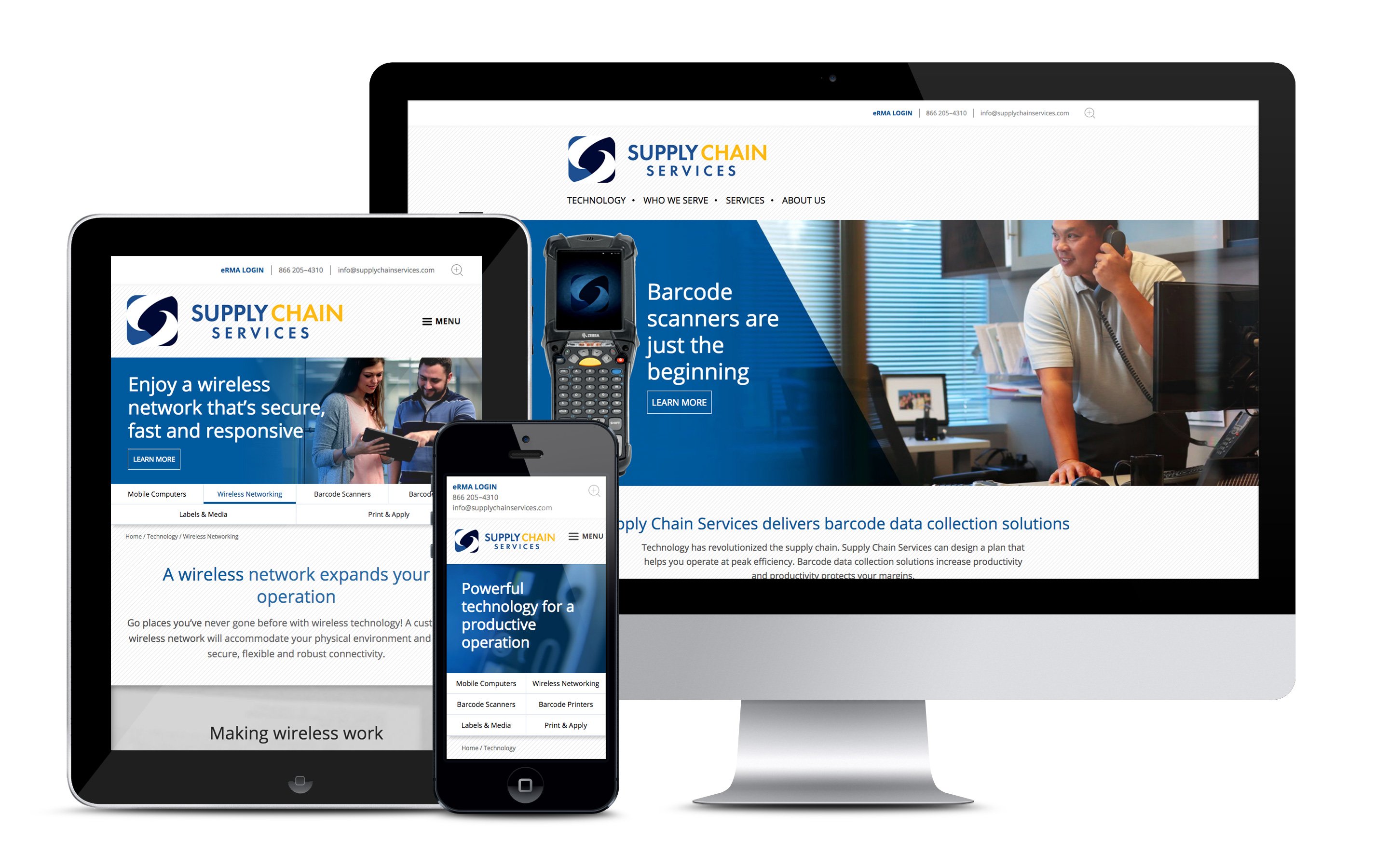
The Supply Chain Services logo now has a contemporary look that represents collaboration and movement. Its elements represent linkage. Vendi produced a detailed style guide that includes approved alternate versions of the logo, photography guidelines, textures, an icon system, bold infographics and other brand elements.
We understand how attached a client can grow to their logo. We have to respect that when going into refresh mode. It’s a balancing act. Keep the strong, recognizable elements. Our client embraced the change we designed, knowing that we listened to and respected their concerns, successfully helping them evolve. They are after all, a tech company, and moving forward is part of tech.
Bottom line, a successful refresh can give your identity new energy and better convey what you’re all about.
Feel free to browse some of the other logos we’ve created.


