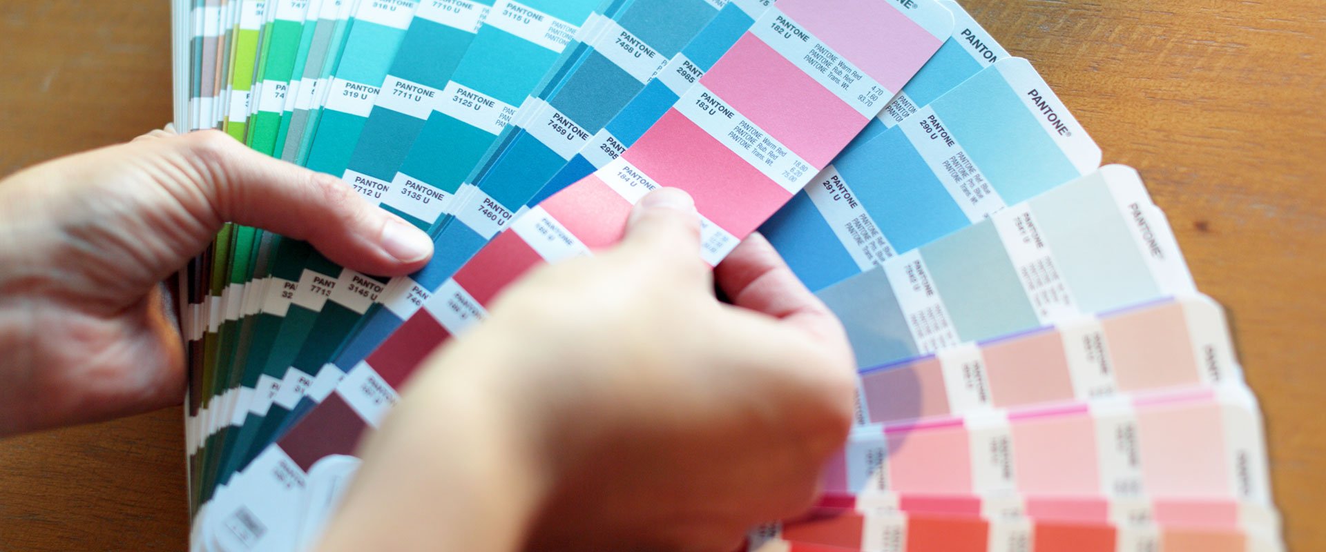
Colors have feelings, too
You’ve undoubtedly been asked “what’s your favorite color?” A question to which there is no wrong answer. Maybe you say blue because you like how that color accentuates your eyes. Or maybe you say yellow because it reminds you of your childhood home. Or maybe it’s black because black is always slimming.
Whatever the color, it’s not just a surface answer. There’s a feeling there, too.
As a designer, friends will sometimes ask for my artistic opinion. Often, it’s to help choose a paint color for a room in their home. My response usually comes in the form of a question: “What is the feel you’re going for? Cozy? Tranquil? Energizing? Calm? Sophisticated?” Once we identify that, then we can narrow our focus.
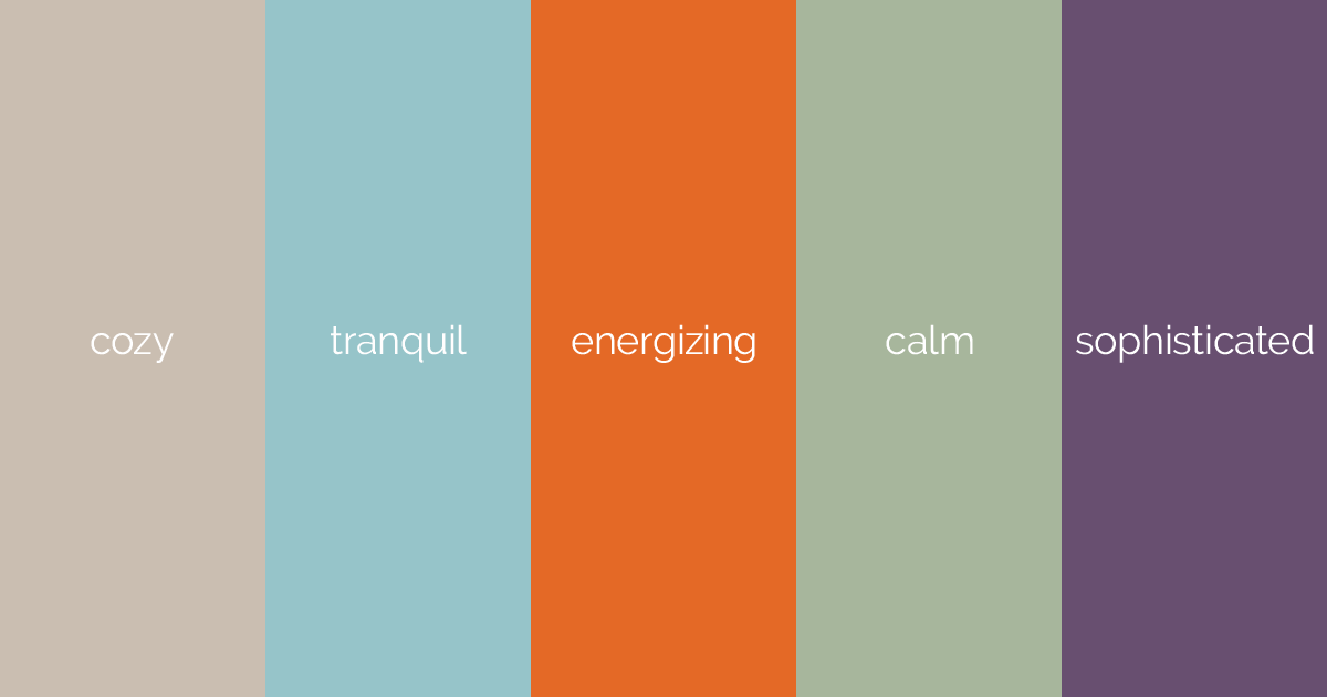
Selecting colors in graphic design is not unlike picking out paint for your walls. Visual communication is, after all, an attempt to affect the viewer’s emotions.
Color selection and brand identity
Collaboration between creative directors, designers and copywriters is required in the strategic decisions made while developing a logo and color palette for a brand. Consideration will be given to many aspects of a brand’s identity, and we’ll ask questions.
Is one of the brand’s key attributes trustworthiness? Then blues might be a good option.

Is the logo representing a bold, passionate cause? Reds and oranges come to mind.

Does the brand cater to young children? Bright, high-intensity colors could be the answer.
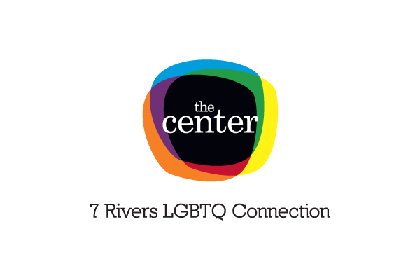
How do we best represent brand ideals of acceptance and inclusion? We include a multitude of colors to create depth and togetherness.
Throughout the design process, we strategically apply some objectivity to a highly subjective thing by understanding what feelings can be evoked by certain colors, then applying that knowledge to achieve the desired results.
At Vendi, we’ve developed logos for dozens of clients. Each time, taking into account the personality and goals of the brand. We welcome the opportunity to do the same for you.